
Project Overview:
Reimagine the UI/UX of an existing brand's mobile app to improve the user's experience. The main focus is on prototyping the motion for the new user interface. I chose to remake Buyee's mobile app interface since I am a regular user and found some things I thought could be improved for a smoother experience.
About the Client:
3 different iterations of the creative brief were created as the project progressed and the pages below are part of the final 3rd revision.
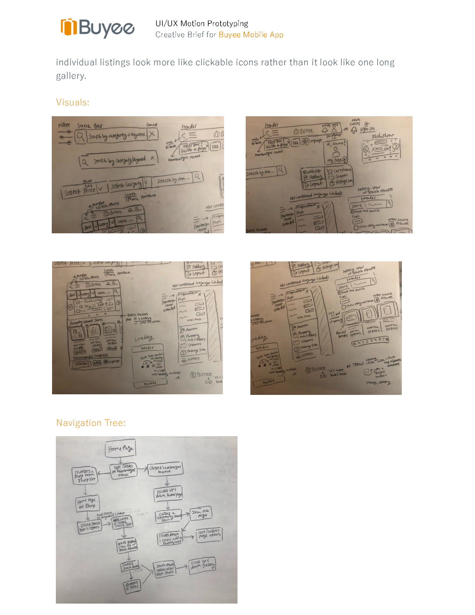
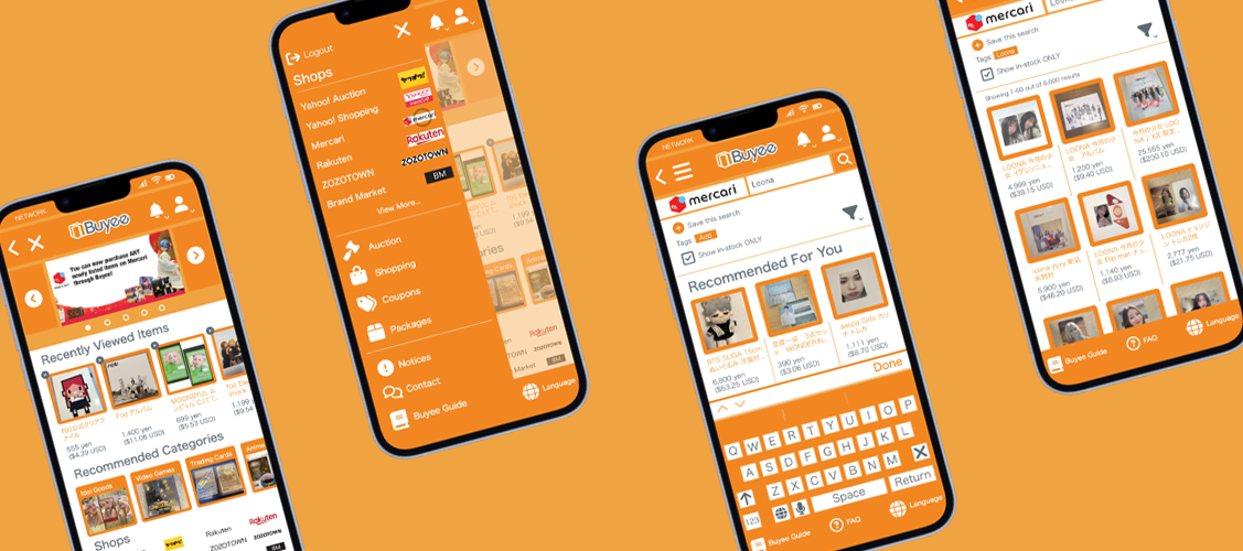
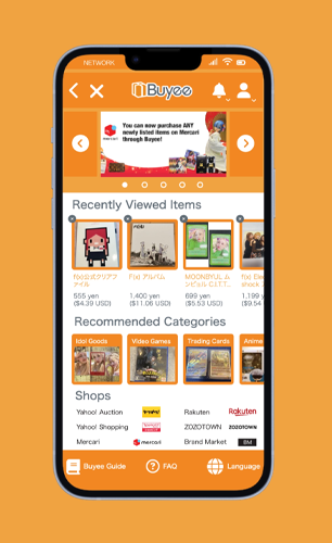
The focus will be on the Mercari Japan section of Buyee. The loading bar of the overall app feels too sluggish and feels like it is doing nothing; it needs to provide more feedback to the user. The overall aesthetic of the layout can be cleaned up to better match the brand of Buyee. There should be an option to access all the filters together either within the search bar or below it. Placement of clickable items should also be placed in more intuitive locations, mirroring typical experiences found in other, successful shopping apps. The listed items should have more of a buffer between one another; for example, a rounded border can make the individual listings look more like clickable icons rather than it look like one long gallery.
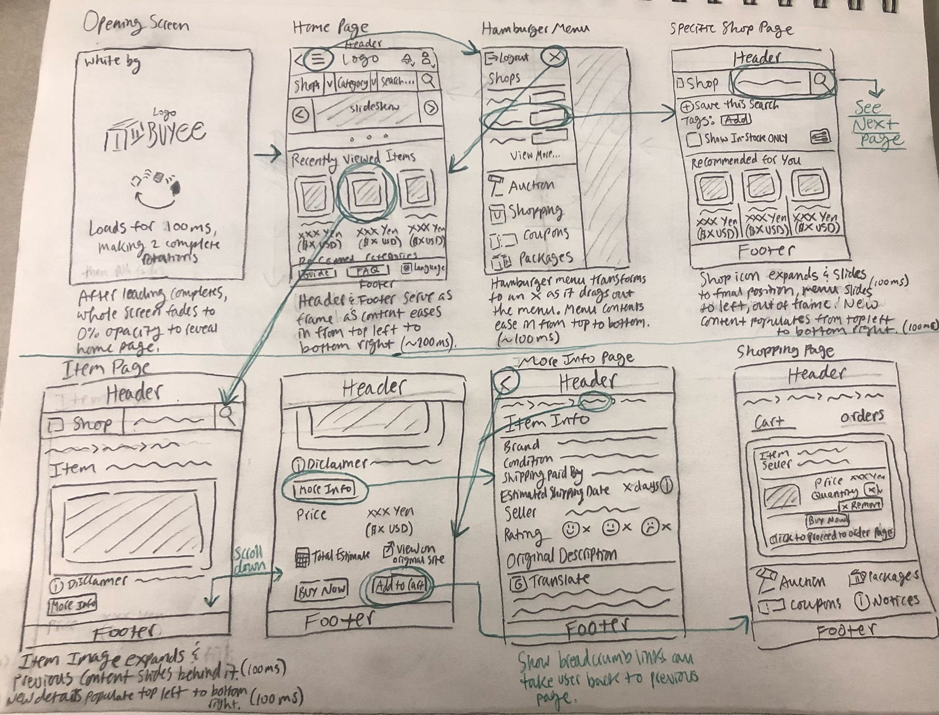
Rough Storyboard 1:

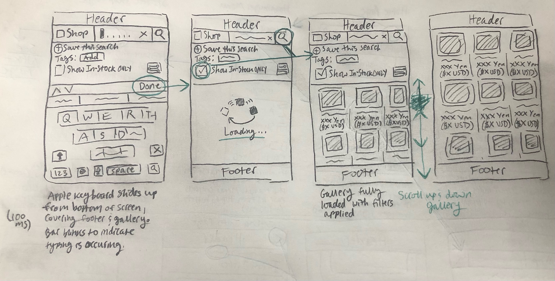
Rough Storyboard 2:
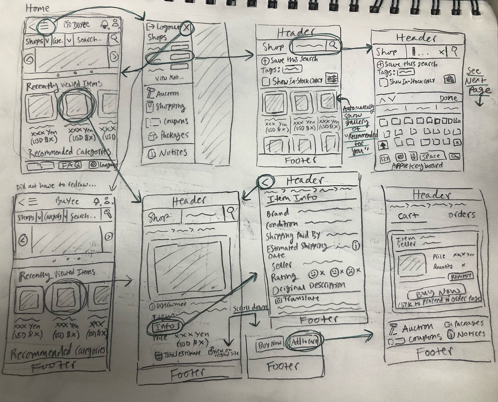
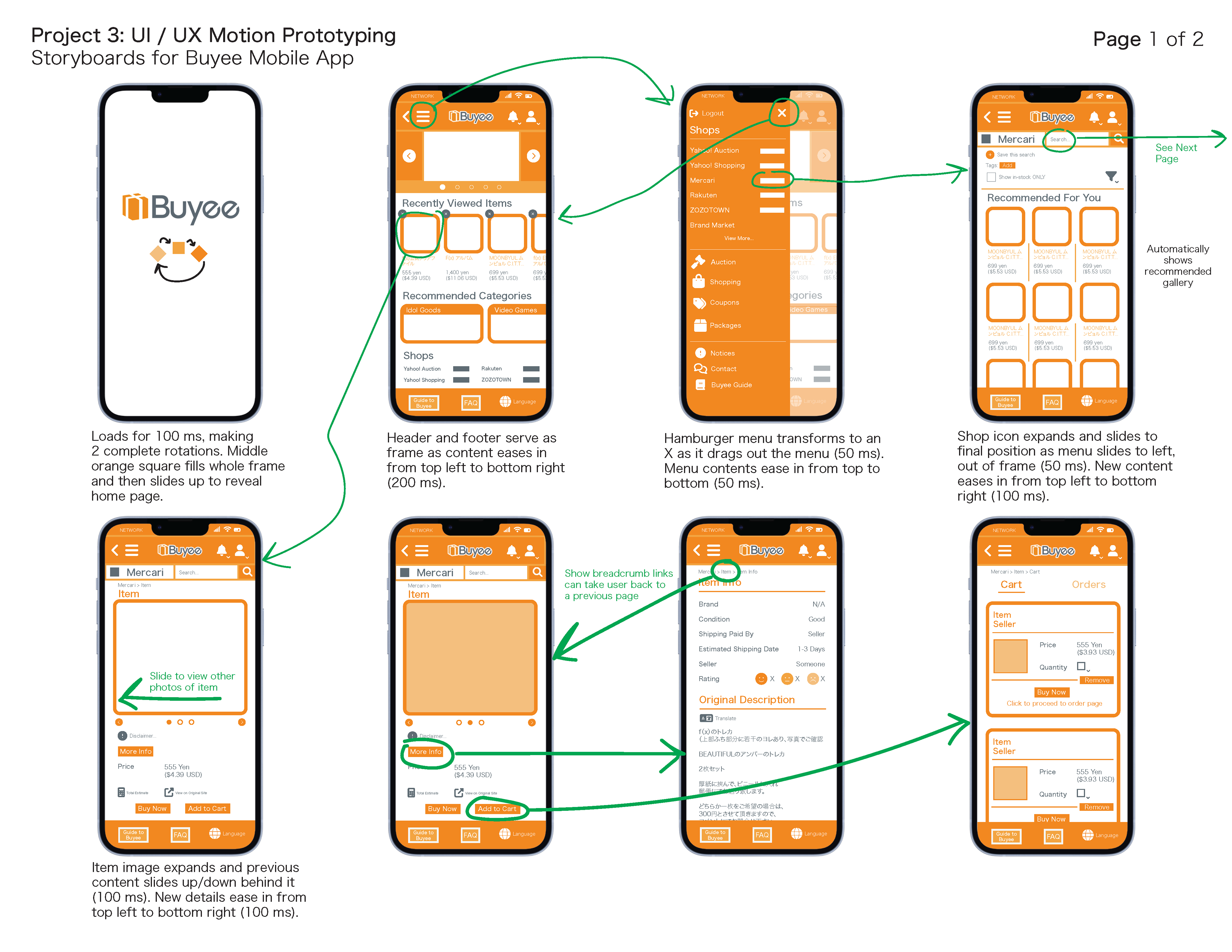
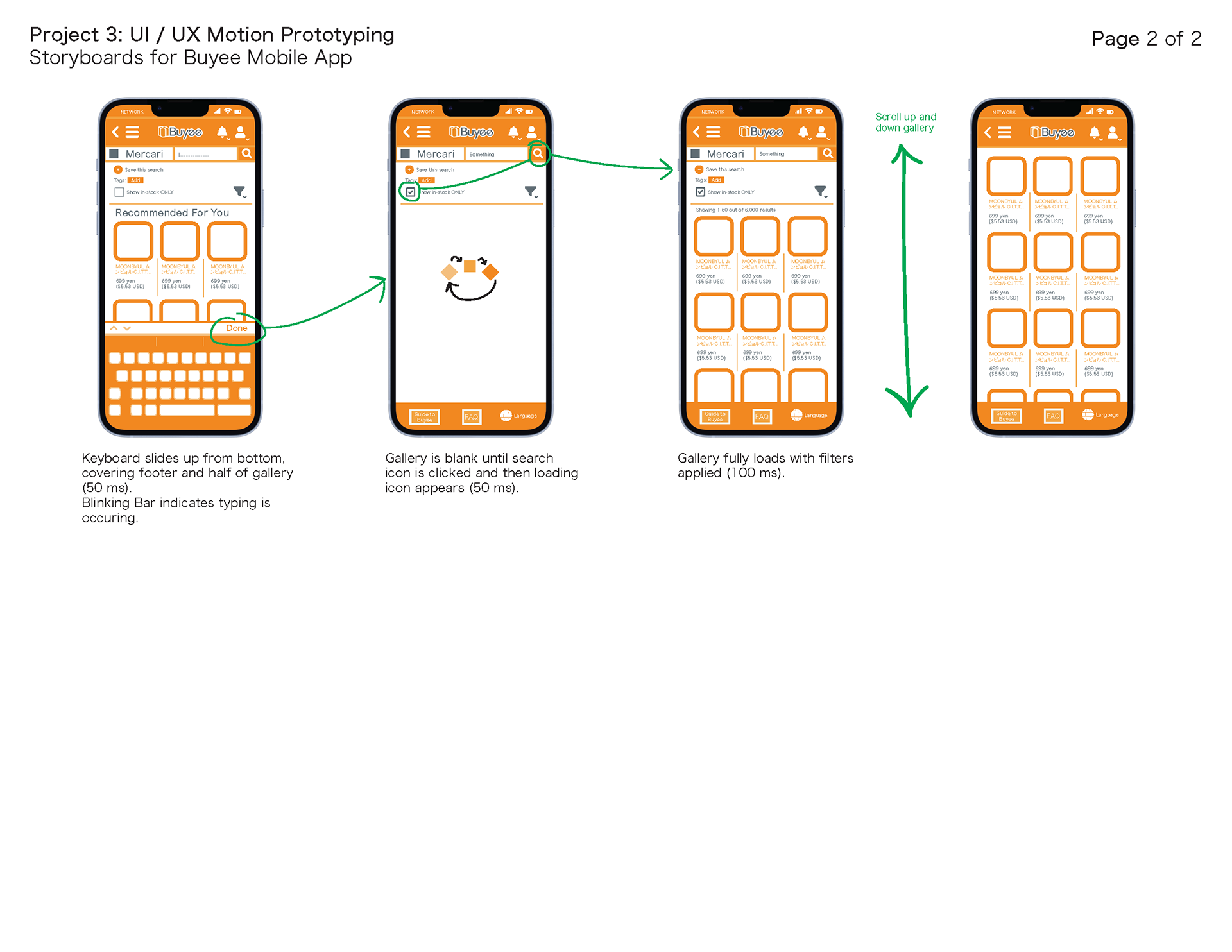
Final Storyboard:
Results

This project taught me the proper workflow for creating assets in Illustrator with the end goal of animating and compositing in After Effects. Researching evidence-backed guidelines for user interfaces made me approach the asset creation and animation with a different viewpoint; Use user experience best practices to inform design decisions instead of relying solely on aesthetics.