

Overview
St. Helen of the Cross is a Roman Catholic Church named after Saint Helen and her story. This branding strategy aims to bring this church into the modern age while still maintaining the message of the church’s mission and vision statements.
The characteristics of St. Helen’s brand are associated with preserving precious relics and discovering faith everyday. The brand should give off a modern feel that is rooted in history at the same time. Most of all, the brand should communicate that the parish community of St. Helen of the Cross is determined to serve all people of God through the love that comes with their faith in Jesus Christ.
The purpose of the St. Helen’s Style Guide is to maintain brand consistency in all communications used to represent St. Helen of the Cross as a warm and welcoming parish community. This guide will help successfully spread the discovery of faith to all.

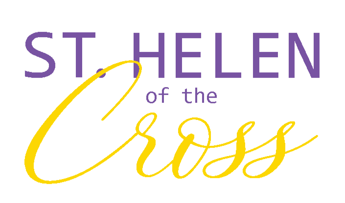
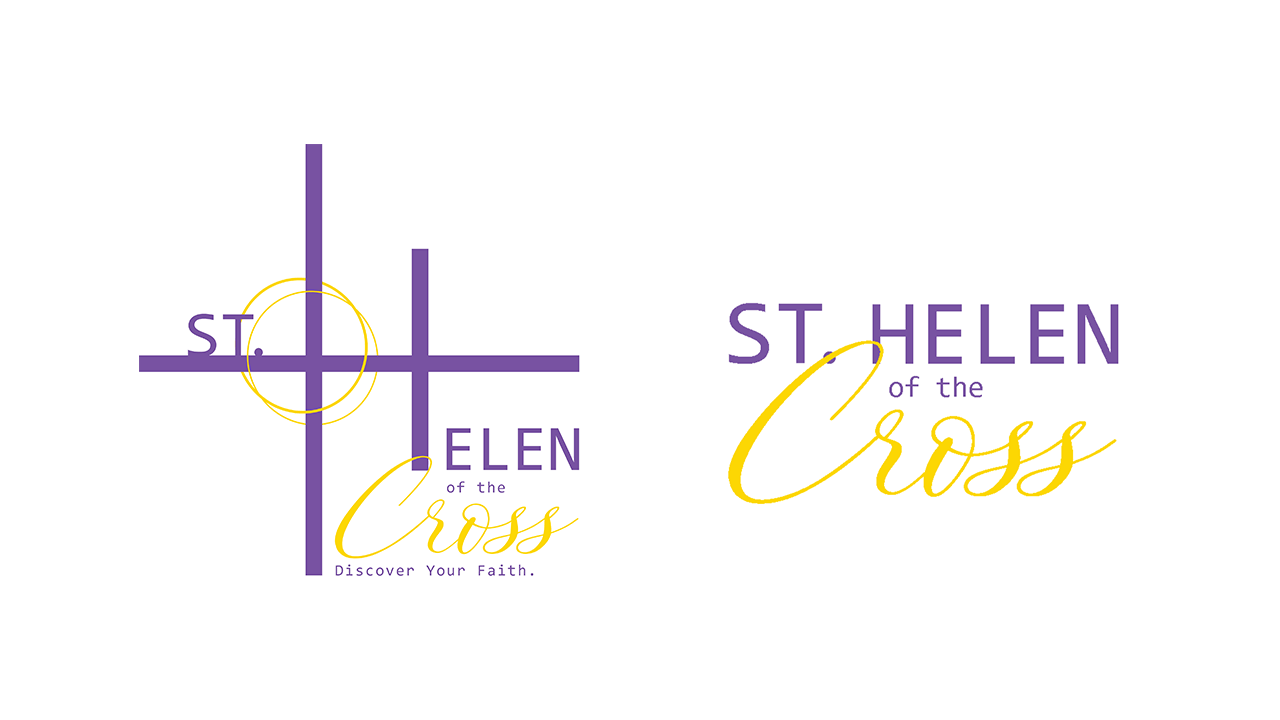
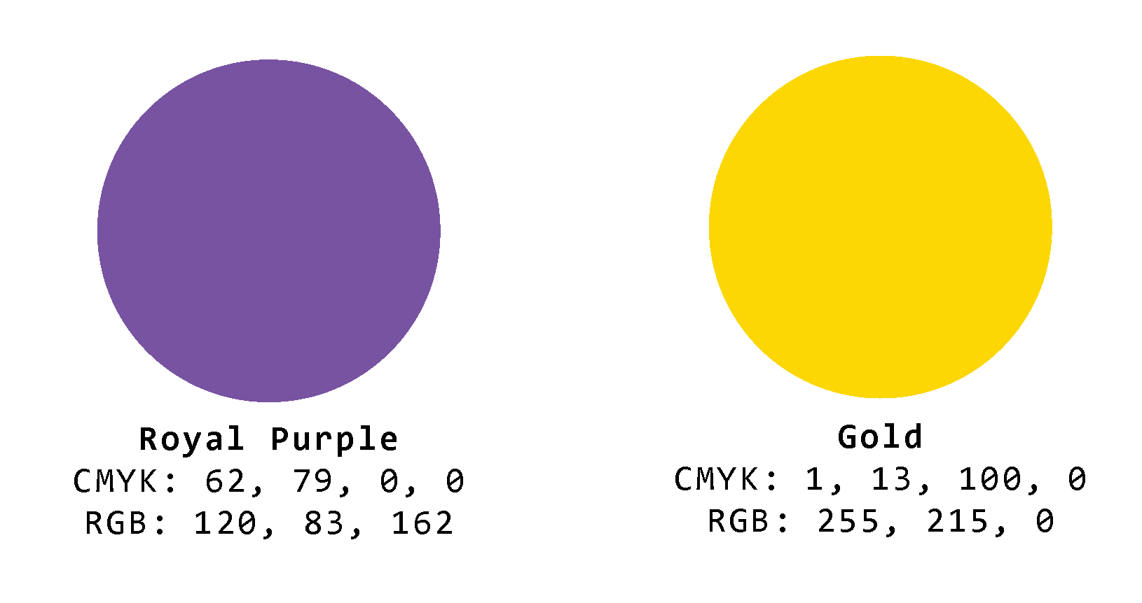

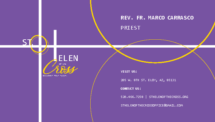
Before begining the design process, I wrote up a proposal detailing a plan to research the Saint Helen herself and learn the history of the church in general. I also expressed having the colors royal purple and gold already in mind for the logo due to their strong meanings both in and out of the Catholic faith. After the proposal, I made sketches experimenting with the name of the church until I found that part of the capital 'H' could represent a cross. It nicely tied into the full name of the church and from there I took my sketch ideas to the computer to experiment digitally. The logo was made in Illustrator while all of the stationary was made in InDesign.

Business Cards

Self-Mailer


Letterhead & Envelope


Fax & Order Form


Results
This branding project taught me how important typography is to making logos stand out and work consistently across multiple applications. Making a style guide for the first time taught me how to consider every small detail of a brand from beginning to end in order to keep all components on the right track for the brand's overall story.